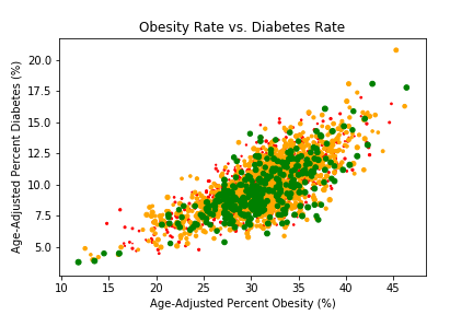
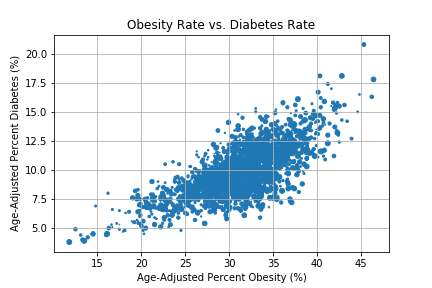
Plot: Obesity Rate & Diabetes Rate in Different Food Environments (County Level)

This graph shows both the obesity rate and diabetes rate at county level.
- "Green" dots represent the low-leve fast food restaurant density counties.
- "Yellow" dots represent the mid-level fast food restaurant density counties.
- "Red" dots represent the high-level fast food restaurant density counties.

.png)
.png)